

GUIDE · MENU
Restaurant menu board: how to design a wall menu that sells
A menu board above the counter is a salesperson that works all day. A well-designed one shortens the queue, guides choices and draws attention to the dishes with the best margins.
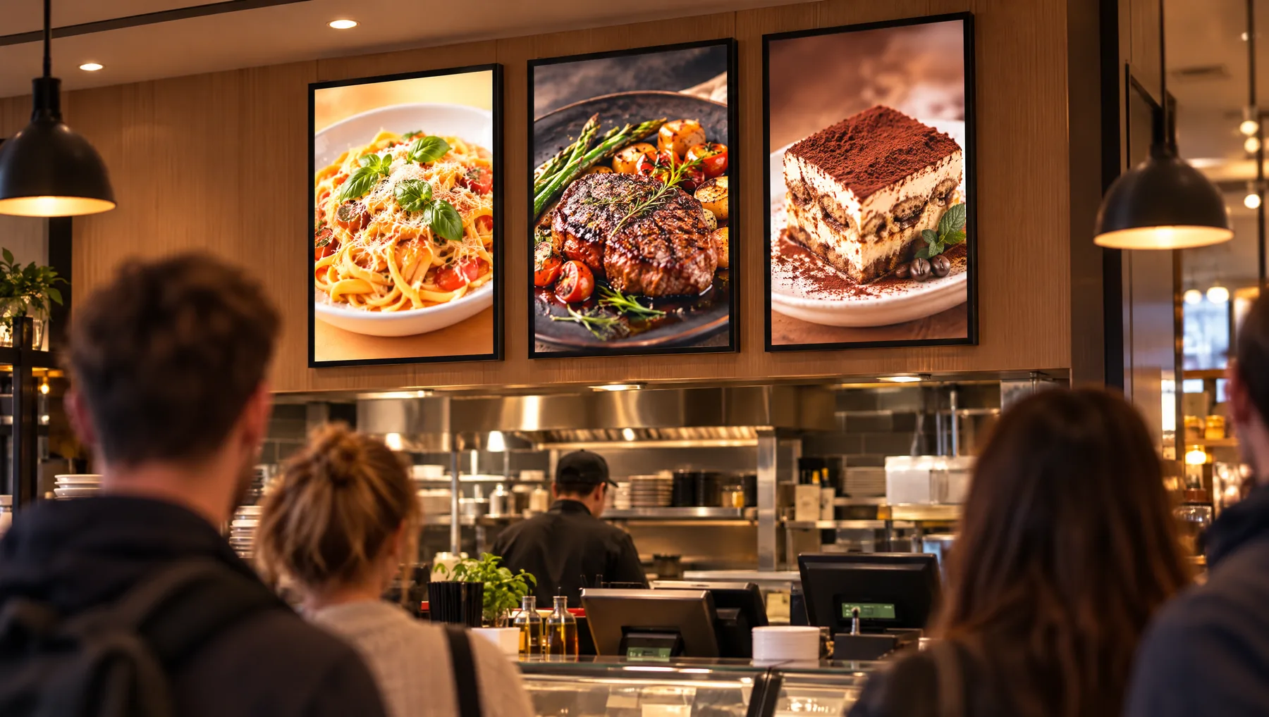
Fewer items, better readability
A guest standing in the queue will read a few items, not dozens. Show your best-sellers and seasonal hits on the wall, and keep the full menu on paper or at the till.
A photo sells faster than a description
A large, appetising photo of a dish works better than a long list of ingredients. Backlit, food colours look rich and vivid, and guests choose with their eyes before they reach the till.
Rules for a good layout
- Key dishes at the top, at eye level.
- Name and price in a large font, readable from a few metres away.
- Dark backgrounds — they look better backlit than white ones.
- Sections: mains, starters and snacks, drinks, desserts.
- One item highlighted as the chef's recommendation.
A menu board made of several frames
Instead of one large board, you can hang several frames side by side. You change each part of the menu separately — for example just the dish of the day or the seasonal drink — without reprinting everything.
Look at your menu through your guests' eyes
Stand at the back of the queue and check what you can see. If you have to squint, the font is too small. If you don't know where to look, there's too much on the board.
YOUR VENUE. YOUR DESIGN.
Show us your location.
An interior photograph and brief offer description are enough to start. We will help choose the model, format and print for what the customer should see.
FOR ADVERTISING AGENCIES
Sell frames and earn on every poster change.
Join the LEDMESEE partner programme: attractive agency pricing and 30% off to start. We are looking for partners worldwide.