

GUIDE · DESIGN
How to design an advertising poster that sells
A good advertising poster can be understood in three seconds. Here are the rules that help you design artwork that is readable from a distance and looks great when backlit.
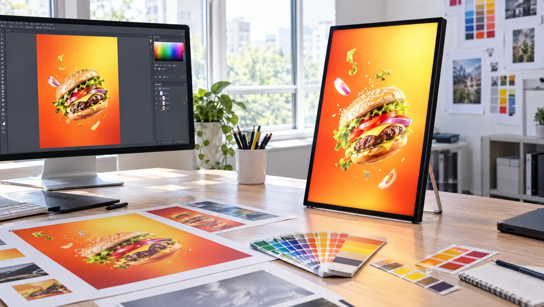
10 rules for an effective poster
- One message per poster.
- A large photo filling most of the space.
- A short headline — ideally just a few words.
- A font that is readable from where the customer stands.
- Strong contrast between text and background.
- Price or key benefit visible at a glance.
- A small but visible logo.
- Keep important elements away from the edges.
- A consistent style with the other posters in your venue.
- One call to action: order, come in, ask.
Colours when backlit
A poster in an LED frame is lit from behind. Saturated colours and darker backgrounds look deep and elegant, while large white areas can be too bright. Prepare your file in CMYK at 300 dpi at 1:1 scale.
Test before printing
Print the design in a small size, step back to the distance customers will view it from, and check what you see straight away. If you have to stare, simplify the design.
YOUR VENUE. YOUR DESIGN.
Show us your location.
An interior photograph and brief offer description are enough to start. We will help choose the model, format and print for what the customer should see.
FOR ADVERTISING AGENCIES
Sell frames and earn on every poster change.
Join the LEDMESEE partner programme: attractive agency pricing and 30% off to start. We are looking for partners worldwide.